Stick Page Forums Archive

Star Butterfly drawing

Started by: Rebmund10 | Replies: 4 | Views: 2,043

Rebmund10
2

Posts: 711
Joined: Sep 2013
Rep: 10

View Profile
Apr 24, 2017 1:01 PM #1479121
So I decided to draw Star Butterfly with a wand-scythe thing and then experiment with glow and shading in Paint Tool SAI. Here's the result:

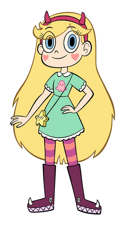
"Star Butterfly" (Click to Show)


CnC would be appreciated since I think I could've have done better.
Person McPerson

Posts: 2,335
Joined: Dec 2014
Rep: 10

View Profile
Apr 25, 2017 1:27 AM #1479128
Dude draw some Gravity Falls.
Grim
2

Posts: 1,237
Joined: Jan 2012
Rep: 10

View Profile
Apr 25, 2017 4:20 PM #1479141
Looks pretty damn close to the real thing, but something's off about her face. I can't put my finger on what it is specifically though.
Charry
2

Posts: 2,260
Joined: Jul 2013
Rep: 10

View Profile
Apr 26, 2017 7:49 AM #1479170
Quote from Grim
Looks pretty damn close to the real thing, but something's off about her face. I can't put my finger on what it is specifically though.


I looked up concept art (I don't know this character), and noticed it right away.
Image
The eyes are bigger and taller in this picture.


Anyway, regarding feedback, I think you should define the shape of the arms more so the elbows are more clear, as well making them less like just tubes.
The shading is probably the biggest issue for me, there's a lot of noticeable smudging where you've coloured it in, which takes away from the solid cell shading of everything else, especially since you did fine with the lighting, it's best to just stick to one or the other. And myself I'd make the shading a little stronger, characters in a basic cartoon style usually don't have very soft shading and stick to a palette of strong bold colours.
Lastly, a bit of a personal thing but I think the scythe is a little overdesigned (haven't a clue if it's something you came up with or it's an official thing she has but yeah), and I think it should be higher up, it doesn't seem like she's holding it to me based on where her arms are.
Overall it's a nice simple drawing, I like it.
Rebmund10
2

Posts: 711
Joined: Sep 2013
Rep: 10

View Profile
Apr 27, 2017 12:46 AM #1479181
Quote from Charry

Anyway, regarding feedback, I think you should define the shape of the arms more so the elbows are more clear, as well making them less like just tubes.
The shading is probably the biggest issue for me, there's a lot of noticeable smudging where you've coloured it in, which takes away from the solid cell shading of everything else, especially since you did fine with the lighting, it's best to just stick to one or the other. And myself I'd make the shading a little stronger, characters in a basic cartoon style usually don't have very soft shading and stick to a palette of strong bold colours.
Lastly, a bit of a personal thing but I think the scythe is a little overdesigned (haven't a clue if it's something you came up with or it's an official thing she has but yeah), and I think it should be higher up, it doesn't seem like she's holding it to me based on where her arms are.
Overall it's a nice simple drawing, I like it.


Thanks for the feedback! I appreciate it. I'll take note of the stuffs you said in my next drawing.
Website Version: 1.0.4
© 2025 Max Games. All rights reserved.