Collage
Started by: Fallen | Replies: 10 | Views: 1,176
Fallen2Posts: 392
Joined: Dec 2005
Rep: 10
View Profile This is my first collage, I think it's pretty good.
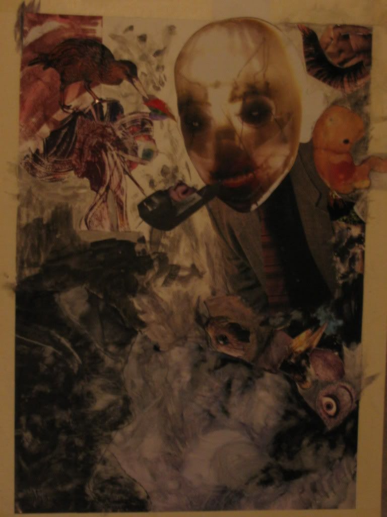
It's like 18x24 on illustration board.
Any comments or whatever are appreciated.
Slayer2Posts: 2,088
Joined: May 2006
Rep: 10
View Profile That's cool, I like the smokey stuff at the bottom, and that tentacle thing in the top left.
Fallen2Posts: 392
Joined: Dec 2005
Rep: 10
View Profile Thanks. The stuff at the bottom are some black and white portraits from magazines that I ****ed up with lacquer thinner. The thing at the top is a monotype print.
Only 1 comment? :/
Beta2Posts: 776
Joined: Feb 2007
Rep: 10
View Profile Is there even a concept or main idea behind it, or did you just find a bunch of pictures in magazines and said "well these look cool, I'm going to go glue everything I can find to a piece of paper and hope people think it looks cool because it looks cool"?
CosmonautBannedPosts: 2,592
Joined: Dec 2006
Rep: 10
View Profile Fallen2Posts: 392
Joined: Dec 2005
Rep: 10
View Profile Of course there is a concept, although it isn't exactly pulled of how I originally intended.
Nebakenezzer2Posts: 273
Joined: Nov 2006
Rep: 10
View Profile I could easily imagine seeing this on an album cover
great job
Beta2Posts: 776
Joined: Feb 2007
Rep: 10
View Profile Then what is your intended concept?
Oh, and by the way, in collages, it's more than visual. You can achieve your goal by using texture, color, shape, and even smell. It's not simply visual.
Nebakenezzer2Posts: 273
Joined: Nov 2006
Rep: 10
View Profile people cant very well smell his college through their computer screens.
Fallen2Posts: 392
Joined: Dec 2005
Rep: 10
View Profile It was supposed to be about not wanting to grow old, but with the magazines I had and my lack of money I couldn't find a baby head big enough to fit on the suit. So instead I used that creepy thing which is a fetus, I believe. The bird is pulling what is meant to be a brain out of the ear, which is supposed to represent me having a hard time doing/coming up with anything "deep"
The assignment was about line and texture, which there is plenty of. And making something with meaningful to us.
Beta2Posts: 776
Joined: Feb 2007
Rep: 10
View Profile The collage isn't bad, but the concept isn't very well developed.
I thought something entirely different.
It seems that only the top half tried to convey the concept, and the bottom half was just fillers.