Gimme A Good Color Combination For My Logo (pls)
Started by: S.A. | Replies: 22 | Views: 3,972
S.A.Posts: 942
Joined: Feb 2012
Rep: 10
View Profile
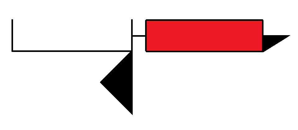
Explanation
- It has the lower-case letters 'y' and 'a' which stands for YesAye.
- It's been made to look like spectacles, because intellectual (and I have one too.)
- The reason there's a blank space in 'y' is because it follows the idea that -
'Though my life has been filled with vibrant experiences thus far, I have yet to experience more, for which I have ensured enough space.'
Some of you already know that I'm working on a blog, so I made this logo for it.
I actually like it how it is, but thought I might as well take the suggestions of my stickpage friends for it too. <3
(this is a second chance after not giving me a proper name for the blog sections D:<)
Thanks!
S.A.Posts: 942
Joined: Feb 2012
Rep: 10
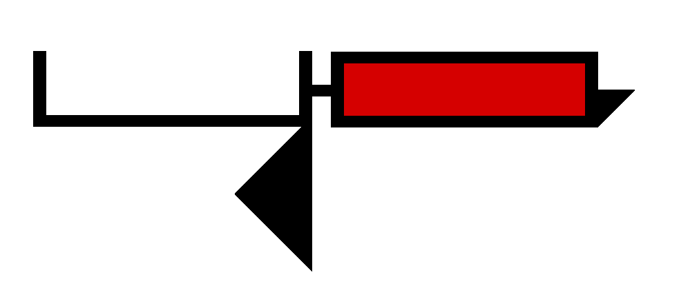
View Profile I played around with the thickness of the lines, and would you look at this beauty:
I think I'm keeping it, unless anyone could come up with a better version?
Creepin_Bro2Posts: 757
Joined: Mar 2016
Rep: 10
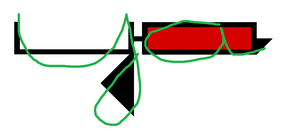
View Profile It was hard to tell that those were a Y and an A, even after reading that they were it took me a bit to see it
might just be me tho
might want to make those letters less wide as well
Xyskal2Posts: 1,528
Joined: Jul 2015
Rep: 10
View Profile It was hard to tell that those were a Y and an A, even after reading that they were it took me a bit to see it
might just be me tho
might want to make those letters less wide as well
I still can't see the letters.
S.A.Posts: 942
Joined: Feb 2012
Rep: 10
View Profile
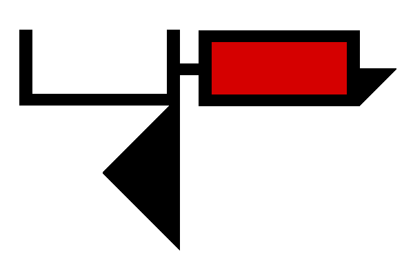
I reduced the length, how's it:
Person McPersonPosts: 2,335
Joined: Dec 2014
Rep: 10
View Profile MrRe1gn2Posts: 106
Joined: May 2017
Rep: 10
View Profile hmm, I think you should reduce the wide length of the Y's (U)
Hope you know what I mean...
Person McPersonPosts: 2,335
Joined: Dec 2014
Rep: 10
View Profile hmm, I think you should reduce the wide length of the Y's (U)
Hope you know what I mean...
Yeah, but then it won't look like glasses and a nose, which I think that is what he is trying to do here.
MrRe1gn2Posts: 106
Joined: May 2017
Rep: 10
View Profile Yeah, but then it won't look like glasses and a nose, which I think that is what he is trying to do here.
Ah yes, missing dat part.....
S.A.Posts: 942
Joined: Feb 2012
Rep: 10
View Profile OoOoOoh classy.
Oh yeh bbey
hmm, I think you should reduce the wide length of the Y's (U)
Hope you know what I mean...
I did do that. See the
second spoiler.
How does that look guys? Or should I keep the length somewhere in between of those two?
MrRe1gn2Posts: 106
Joined: May 2017
Rep: 10
View Profile hmm, ask for a drawing from ACFH if you want a better version, but pay him with 1 RHG win point... (I would)and for the color...what about the "Y" fillings are Blue and the "A" fillings go Red, like the old' 3D glasses
S.A.Posts: 942
Joined: Feb 2012
Rep: 10
View Profile but pay him with 1 RHG win point
Wtf that's a thing now? RIP RHG System.
I did give a thought to making it a
3D glass but then it would have no meaning.
Go through the explanation of the logo in the first post and you'll know why I left it blank.
MrRe1gn2Posts: 106
Joined: May 2017
Rep: 10
View Profile about the 1 RHG win point thing, I did it when I was asking ACFH about making me an RHG pic, he did all the hard work for free, like he didn't get anything, and I felt like we didn't appreciate his work, Ik we do, but by saying thank you only? Other than that, I already know why you left the "Y" blank, cuz' of the idea, but you left -, what's that mean
S.A.Posts: 942
Joined: Feb 2012
Rep: 10
View Profile The thing connecting the two letters? If so, that's acting like the bridge between the two lens.
Creepin_Bro2Posts: 757
Joined: Mar 2016
Rep: 10
View Profile there is no payment thing now SA, idk what he's talking about
also, Sol is a girl Re1gn.
and for Re1gn, you can't pay people with RHG wins, they aren't a currency, they are proof of battles won.