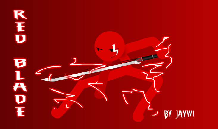
You drew a stick figure with brush tool and put glow on some random squiggly lines
I don't want to discourage you from doing what you want, but please put more effort into what you post in this section
http://forums.stickpage.com/showthread.php?53105-ART-STANDARDS-A-Scarecrow-Public-Service-Announcement
This is a stick figure
We aren't CnCing a stick figure.
I don;t care how BAD a piece of artwork may or maynot be but when someone takes the time to produce a piece of art and then asks for CnC to help get better at what they do then you either CnC or gtfo.
My CnC:
* I can see you're a beginner at this so I'll try and stick to the fundamentals so that at a base level your future stuff will (hopefully) appeal to m ore people.
The first thing I would say you should consider is composition. Right now you have a fairly flat and slightly boring layout. Your character is in the middle of the canvas, your text is perpendicular to the boarders of your canvas, you have a select range of value from the red hue and white as your only 2 colors. Try taking a some chances when it comes to your artwork, since your working digital if it doesn't come out right then just undo!
Aside from just simply taking chances on things, you should think about how font types can either make or break a picture. The font that you used (while better than comic sans lol) is more a font you would use for a Dr Jekyll and Mr Hyde spooky fiction novel. Based on your pose It seems like you want a fast and slick looking kind of feel for this pic so try and stick to "Slick" and "fast". So try text that has a slight angle or science fiction-y kind of vibe (technology like text might work too).
Also to further push the aforementioned Slick and fast feeling pic, try adding elements to help boost the speed of your image. Racing lines, subtle blurs, and things at and angle REALLY help push that feeling of dangerous and fast. B titling your character and having lots of long sweeping curves or speedy lines it gives you picture motion and a mood (something that you currently lack here).
*also pro tip. Try not to make lighting with the brush tool for still images, it typically looks too thick and generally comes out bad. To get a really good lighting/electric look try and sketch out all the branches and then desgn the lighting using the line tool. This allows you to get your lightning crisper and sharper looking (again boosting the feeling of that slick and fast feeling).
Don;t give up so easily man, just practice practice practice and you'll get better in no time at all. I dont know if you want to make stickart as a hobby, or if this was a one time thing but these principles work for just about any type of design oriented art so just keep them in mind no matter what your creating :)/
Here's an example I quickly made to show you what doing the things I mentioned can do to really "sell" an image.