First, start out with a basic outline of what your drawing. For me, I use black as the basic background, light blue as the far away scene, and green as the foreground, or close objects, all in different layers so it's easier to edit.
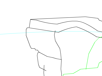
Second, once you decide a good outline of what you want, start making it more detailed. Delete the overlapping lines. If your wanting to have shadows, then make those shadow lines afterwards (for this BG, the shadows are represented by dashed lines). Don't get too detailed just yet, because coloring is essential and more important than little details.
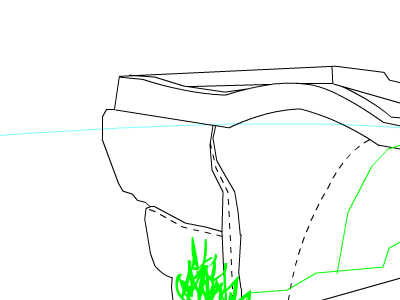
Third, is a little coloring. Always figure out what color scheme will work, because colors that blend into eachother and match are better than seeing a tye-dye background. In the two pics, I started out with the basic coloring of the far away scenery, then move up to the rest.
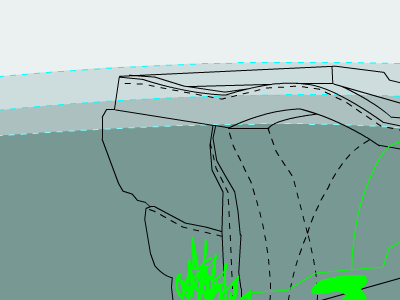
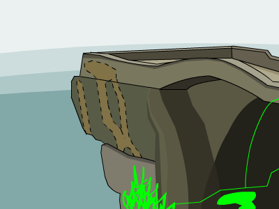
As you can see, it's already looking great. The color scheme just looks perfect!
For the Coup de Grace, details. Add as many or as little you want. Don't make it overbearing or too distracting. Too many details just looks overdone and bad. Also, it's a good time to delete things you may not have wanted. For instance, the plant in the foreground has been erased, as I felt it was too much of a distraction and got in the way of what was behind it.
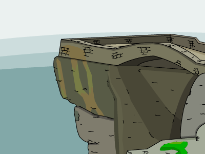
Ofcourse, there is still much to do. For instance, the very far background is just a gradiant. Ugly. But, I leave this is up to you, dear reader, to be on your way and make your own backgrounds. Now get the **** out of my thread.
